
Tuesday, April 30, 2013
Meridian Giant Canvas Print

Wednesday, April 24, 2013
Giant Canvas Print....

Wednesday, March 6, 2013
Historic Timeline
I always do some timeline stuff around here. I like doing the research to figure out what would be interesting and eye catching to put up in a store, so we did one for the history of our company.

Wednesday, January 2, 2013
70/30 on glass

Wednesday, December 12, 2012
surf and sun


Saturday, June 16, 2012
Vinyl

The Tailor Shop
 |
| BELLE CHASSE TAILORING SHOP |

LOOK right and SNACK right!


Colorizing images

I had forgotten to post a picture of this one. It's an antebellum type house that I colorized. The blue's and oranges were used because there are chairs in the beauty shop where this is installed that has the same color in it. So I color matched it to make it all tie together.
The Job In A Box
 |
| JOB IN A BOX 03 |
 |
| JOB IN A BOX 02 |
 |
| JOB IN A BOX TOPPER |
 |
| JOB IN A BOX CENTER PIECE |

Custom Embroidery

A store in Rhode Island wanted something interesting to call out that they do 'Custom Embroidery' for it's soffit. So I did a 8' graphic that we separated into panels to give it a little more interest.
Lightbox images


The top one is the original stock photo. The bottom is the one I enhanced the colors for display. I wanted to really bump it up and make it look almost like a Lomo image.
Forgetfulness.
I am not being as diligent as I should be in regards to posting the material that I've been designing...must work on that.
I had to make this...

Wednesday, May 16, 2012
Sports Shop in Memphis


Tuesday, January 17, 2012
You Asked For It


This is something I came up with for a section in a store where customers were asking for it, and then getting it!
Thursday, June 16, 2011

Wednesday, May 4, 2011
The Original Old Navy Store
 This one's my favorite, just because I thought of the tagline. Very original! HA.
More Centennial Stuff


Yesterday and today was the giant kickoff celebration of the Centennial of Naval Aviation. We had a retail shop open in an old hangar and I saw the stuff I did for it. They used it for a huge display in their. I thought it was kind of cool.
Vertical Hanging Signs
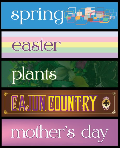

This is just some vertical hanging things. What's fun is getting the pantone color palette for each season and making them work for signs (spring and fall). The New Orleans I'm still messing with. I hate easter colors. Really I do. And I hate crawfish. But it's what they eat there I guess.
Wednesday, April 27, 2011
Another collage-y mural

I guess Corpus Christi has a lot of history, because all of those old images are from their Naval Air Station. I like the guy on the top left. This is going to be a 4'x6' entrance graphic.
Alien Women sitting down.
 Just an image I colorized for a beauty salon. I think I posted this before. I'm not sure. Sometimes I see stuff and post it.
Mother's Day is soon.
 This is just some clip art that I had downloaded awhile back, but I am a swirl fan. That sounds a little weird.
50/50 in Texas

So we have these enormous windows that need to be covered at a barber shop. I wanted to do one of those old timey painted on the glass things, with the gold with the black outline, but instead I went with this, I modified the one I did in Panama City for this window. It's about 78" long and 5 ft high I think. I like it.
Friday, April 22, 2011
Snack Bar

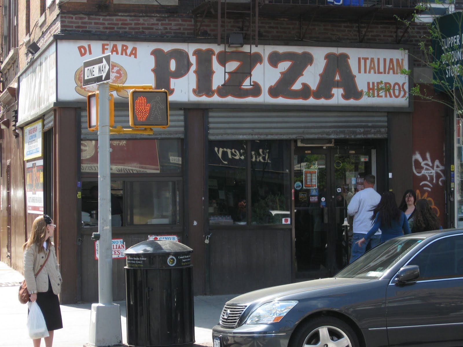
We have a whole mess of little snack bar's all over the place, so we've decided to make some menu's that aren't made out of vinyl. Eventually I'll post the menu's. I'm digging the subway tile again. It makes think of dingy NYC pizza parlors. Those were good times.
Thursday, April 21, 2011

Wednesday, April 20, 2011
Aisle Violators
 These are aisle violators. Or they are aisle indicators. Either way they are about 3 feet long and are supposed to call out stuff on the aisle's. The original version was a kind of techno-new wave version. But I thought it would be cool to change them and make them a little more classical.
Monday, April 18, 2011
The Centennial Stuff is all cut up.

We just finished this yesterday. I eventually wanted to change the glossy frame liners out to some matte one's. The glossy one's look cheap and dirty.
Sunday, April 10, 2011
Entry Signs

 I just did these about a month ago. These were for the entry way signs. Originally they were some crappy vinyl, crap, which was crap. So I re-did with an aviation flair. These are 3'x8' framed out poster prints.
Friday, April 8, 2011
summer in gulfport

Here's a 2'x6' thing I did for Gulfport for this summer. It's bright and fun. Really it's fun.
Sunday, April 3, 2011
Roos Display

So we have this giant display fixture but never anything to put in it, so we did a Columbia thing for Memphis. Just a random picture with a little swirl and some color adjustment.
Subscribe to:
Posts (Atom)